Inspired by @alexvipond's great venn diagram, we wanted to take the time to show you step-by-step how to create a similar map within Kumu. Just a heads up, you'll need to roll up your sleeves and get comfortable in advanced mode for this tutorial.
Let's dive in!
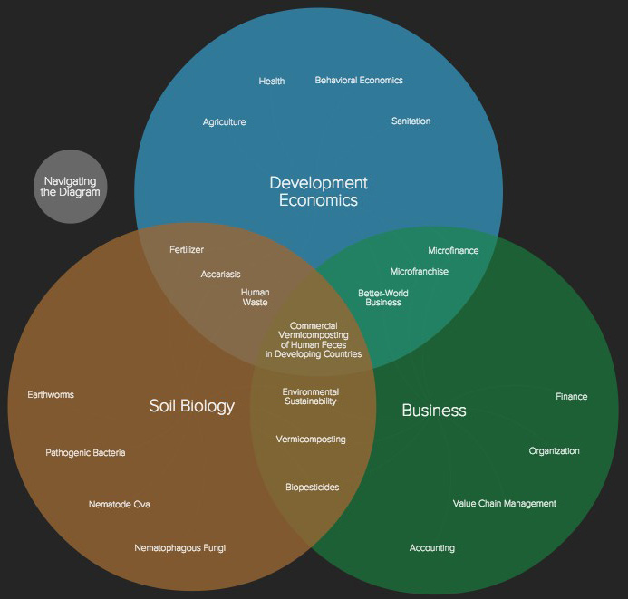
Vennmicompost by @alexvipond
Wait...why are we using Kumu for this?
You can create venn diagrams in a number of different tools. My guess is that most of you would normally turn to PowerPoint for this. Traditional venn diagrams are great, but there are times when you need to be able to include additional detail within the diagram.
Kumu makes it so you can easily click on any component of the diagram and get a whole profile of additional background. Include images, charts, data, videos - whatever you need to best convey your insights.
Yes this is a creative use of Kumu, upping the shadow size significantly to be able to create overlaps and then using fixed positions to place all the elements. While we didn't envision people building venn diagrams in Kumu, hopefully this sparks some ideas for how to use Kumu's flexibility to create some great and unique maps.
Creating a venn diagram
Set your defaults
Before you get started, make sure you have the right defaults set for your map. You'll see these located in the map overview. Make sure to set these to "fixed" and "undirected":
Default to fixed elements
Default to undirected connections
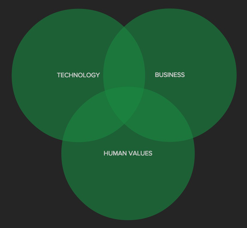
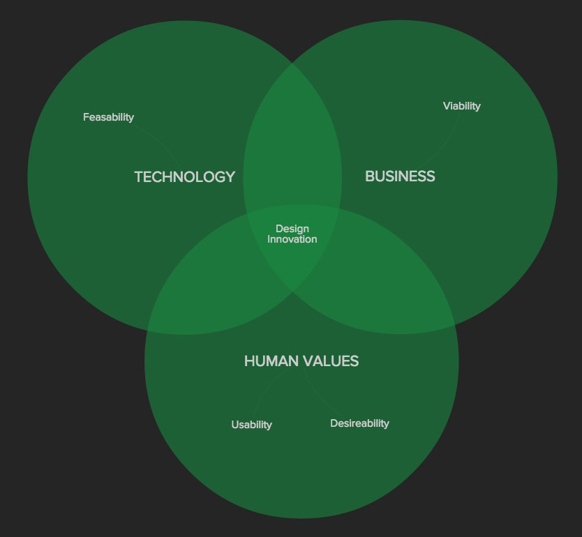
Note: We'll be using a venn diagram from the Stanford dschool for this tutorial that highlights how design innovation is the result of the overlap of technology, business, and human values.
Choose your sets
Start by determining what the circles in your diagram are (we'll refer to them as "sets"). Venn diagrams need at least two sets and start becoming a bit harder to understand and create once you add 4 or more sets.
Add your sets to Kumu by creating an element for each set (our sets in this case are "technology", "business", and "human values"). You'll want to change the element type to "set" and then include the below in your advanced perspective:
@settings {
  template: custom;
  theme: dark;
  culling: off;
  element-font-size: 100;
  element-text-align: center;
  element-color: transparent;
  element-shape: rectangle;
  element-size: auto;
  connection-opacity: 0.1;
  selection-color: #f1f1f1;
  font-cutoff: 0;
}

set {
  size: 10;
  shape: circle;
  shadow-size: 100;
  shadow-color: #19873f;
  shadow-opacity: .6;
  font-size: 140;
}
This does a few things. The @settings block creates the default styles for the map and the set {...} block adds the basic styling for your sets. Once you've saved the above to the advanced tab of your perspective, position your sets to get the desired overlap.
Your map should now look something like this:
Add and connect your factors
Now that you have all of your sets created, start creating your factors by adding elements for each. Since we've already added the default styles through @settings above, you shouldn't need to do any further style tweaks.
Just add the element, position it accordingly, and then populate the profile with whatever additional detail you'd like to provide.
Once you've added your factors, you'll want to connect them to the set they are a part of. This makes it so that when you hover on a given set, all of the related factors will also be highlighted.
The easiest way to do this is to hold shift and use a selection box to select the relevant factors, and then click the "add connection" button and type the name of the set you want to connect them to, and hit "enter".
Here's what your map should look like at this point:
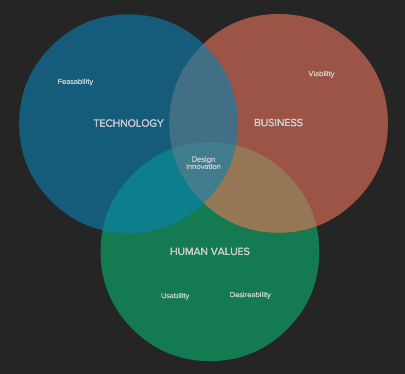
Add some style
Did you think we were going to leave you with each of your sets having the same color? Never! Drop the below into your advanced perspective and replace "business", "technology", etc. with the actual label of each of your sets.
#business {
  shadow-color: #EB7458;
}

#technology {
  shadow-color: #0881B3;
}

#human-values {
  shadow-color: #08B370;
}
Voila! You should have something that looks similar to this:
Now create a presentation with a compelling narrative about your diagram and share it with the world. Even better, post a link to it as a comment below!