Today we're excited to announce that scatter plots are now available to everyone, enabling you to position elements on an xy-grid using attributes.
The possibilities are truly endless with this one:
- Create power maps of key stakeholders around a given issue, using the x-axis to show support and the y-axis for influence
- Spot surprisingly central people within a social network by plotting betweenness against closeness and looking for outliers
- Create timeline views of a network by plotting elements along the x-axis by date
Not impressed?
Well, what if we told you you can do this and still be able to view the connections between elements and still have the full range of decorations available to you for sizing and coloring elements and connections?
Bet you're excited now! Read on to learn how to put this valuable new feature to work.
Analysis of the 2016 Presidential Candidates
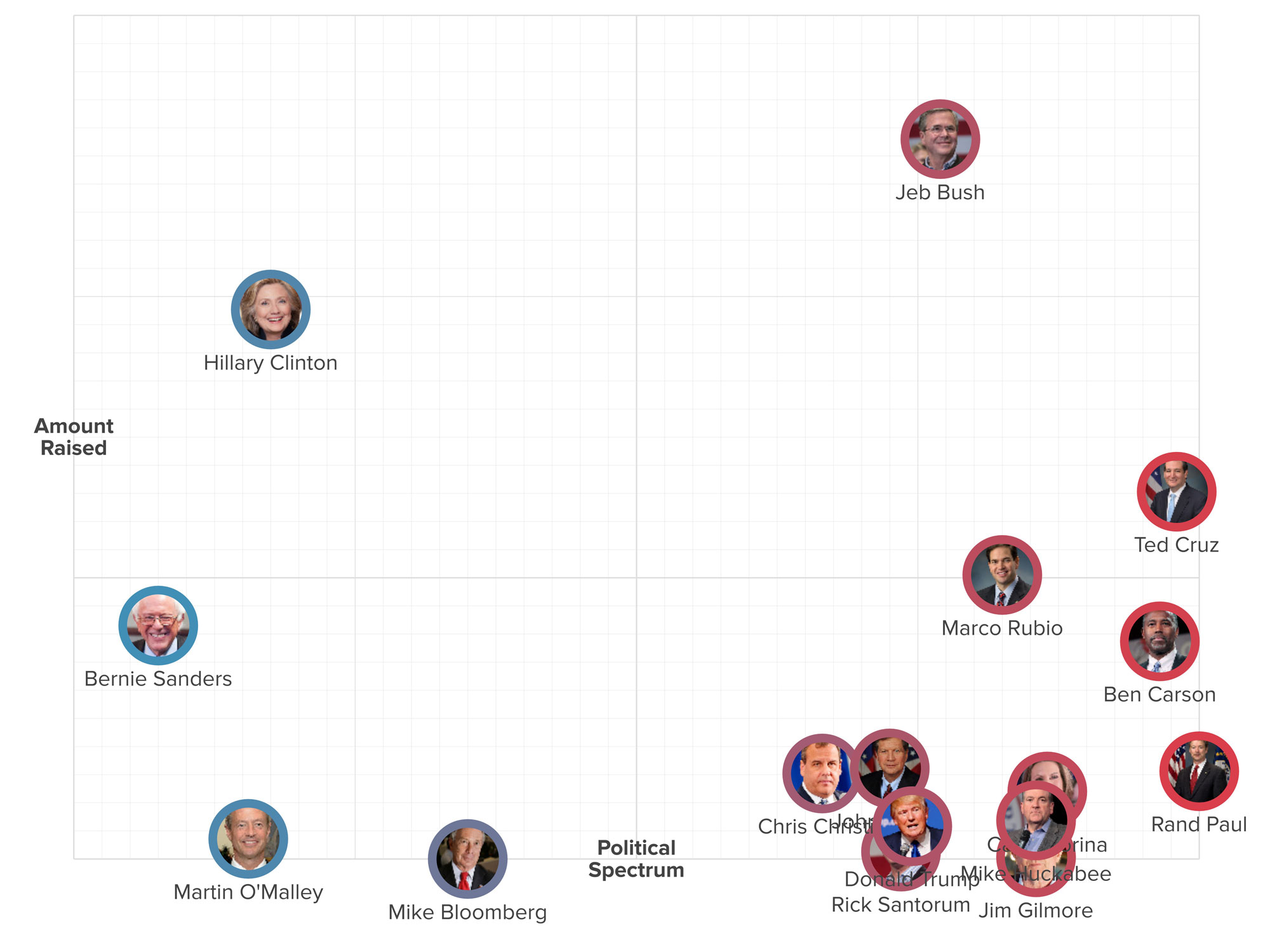
As a quick intro to scatter plots, we've gathered some data on the 2016 presidential candidates. For each candidate we have:
- A political spectrum score from -10 (most liberal) to 10 (most conservative)
- Net worth
- Amount raised
We can create a number of views based on this data. Here's a basic XY scatter using political spectrum as the x-axis and amount raised as the y-axis:
The advanced perspective for this is:
@settings {
  template: stakeholder;
  background-color: white;
  layout: scatter;
  layout-x: "political spectrum";
  layout-x-multiplier: 100;
  layout-y: "raised";
  layout-y-multiplier: 0.00001;
  layout-grid: true;
  layout-bounds-xmin: -1000;
  layout-bounds-ymin: 0;
  layout-bounds-xmax: 1000;
  layout-bounds-ymax: 1500;
  layout-guides: x(-1000) x(0) x(1000) y(500);
}

candidate {
  size: 30;
  color: scale("political spectrum", #3596c0, #d93e4a);
  padding: 6;
}

label {
  size: 0;
  font-size: 24;
  font-weight: bold;
  label-placement: center;
}
From there we can layer in the net worth by adding an element scale:
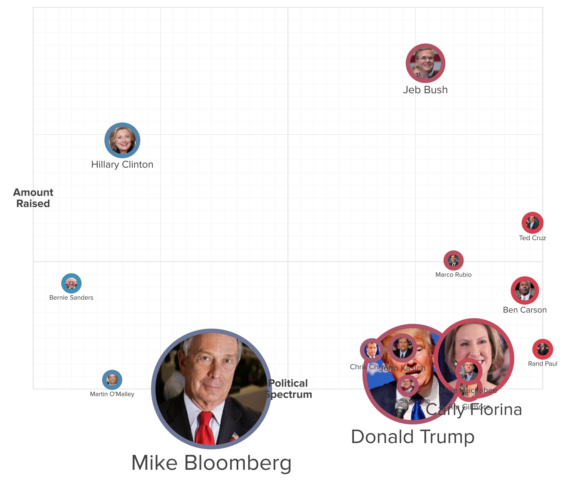
:not(#mike-bloomberg, #donald-trump) {
  scale: scale("net worth", 0.5, 2);
}

#donald-trump {
  scale: 2.5;
}

#mike-bloomberg {
  scale: 3;
}
If we want to show where each candidate falls on the political spectrum without distracting viewers with amount raised we can just drop the y-axis:
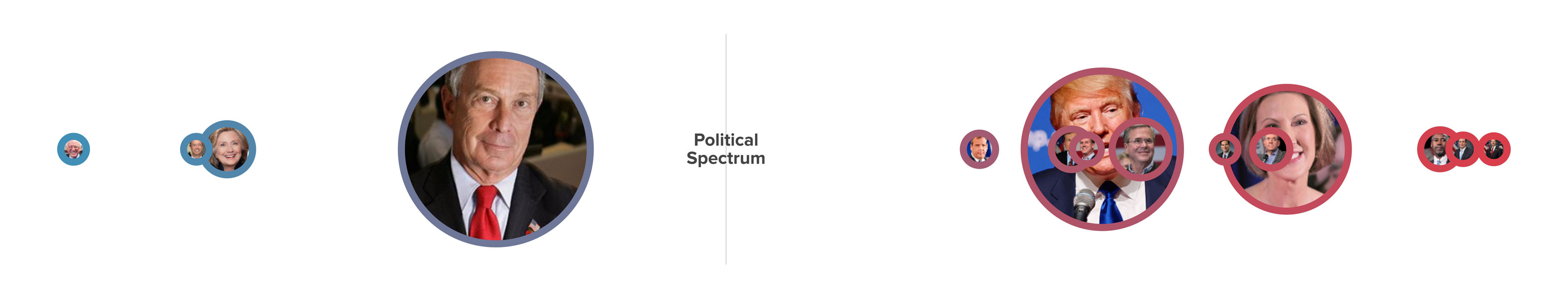
@settings {
  layout: scatter;
  layout-x: "political spectrum";
  layout-x-multiplier: 200;
  layout-grid: false;
  layout-bounds-xmin: false;
  layout-bounds-ymin: -300;
  layout-bounds-xmax: false;
  layout-bounds-ymax: 300;
  layout-guides: y(0) x(0);
}

candidate {
  font-size: 0;
}

#amount-raised {
  display: none;
}
Creating your own scatter plot
We're still actively tweaking the behavior of scatter plots so for now you'll need to be comfortable working in the advanced tab of perspectives to create your own.
Head over to the layout guide to learn more about all the settings available to you and then join the scatter channel in the Slack Kumunity to add your feedback and ideas!