If you've been with us for awhile, you'll know Kumu's interface hasn't changed much in the past two years. We've added new features and polished old ones, but we generally don't like to make major changes to the UI.
Today's an exception...
After months of revisions, we're excited to finally release a completely revamped interface for Kumu!
The changes we've made are the result of thousands of support requests and two years of watching where you've gotten stuck or ran into challenges.
We had four major priorities for this release:
- Simplify terminology
- Simplify the ui
- Make common actions more obvious/intuitive
- Keep related actions close together
When we look back on the old ui it's amazing how many flaming hoops we made you guys jump through. Hopefully none of you caught fire. We're sorry and we hope you love the new changes!
Keep reading for a detailed look at each of the changes and head over to http://kumu.io to experience the new UI for yourself.
Simplify terminology
This type of work already brings enough jargon of its own, so why should we complicate things further? In the spirit of simplicity we've renamed perspectives to "views" and attributes are now called "fields".
Simplify the ui
Nobody likes being intimidated. And we'll admit, although pretty, the old UI was a bit of a bully to newcomers. The new UI is much more welcoming! In general we tried to make the infrequent actions less distracting, especially those you could only do within certain contexts.
You'll notice the buttons for editing the current selection are now included next to the profile instead of the footer:
![]()
Instead of having to fiddle with gravity, particle charge, connection strength and connection length to get your layout just right, you now have a dropdown with three simple options depending on how densely connected your map is (auto, dense, or hairball).
Finally, we've created a whole new way to build out your maps. We call it sketch mode, and activating sketch mode makes it so that clicking on the map adds an element in that location and dragging from an element creates a connection. Need to move an element? Just hold alt while dragging the element.
Make common actions more obvious/intuitive
The driving belief here was that you shouldn't have to teach newcomers how to navigate Kumu. All the common actions they need should be immediately obvious, and the rest should be hidden away as much as possible to avoid distraction.
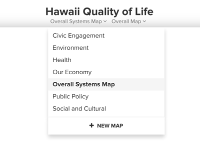
Remember how hard it used to be to switch maps / views? Well those days are over! The new header makes it a cinch to quickly switch between any map or view:
Need help? Click on the help icon in the lower left. Want to open the project overview? Click on the brochure icon in the lower right. Want to leave a comment? Click on the comment icon in the lower right.

We didn't just make things more intuitive for observers though. If you're working within Kumu you'll find it much easier to edit maps, add new ones, and tweak your views until they're just right.
The same add element interface is now used regardless of whether you're adding new elements using the add button, ALT+CLICK, or our new "sketch" mode.
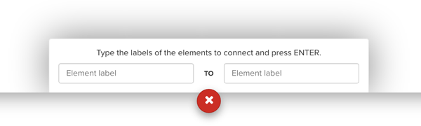
The add connection interface is more flexible, allowing you to add connections between elements that don't even exist yet. No need to select an existing element first anymore!
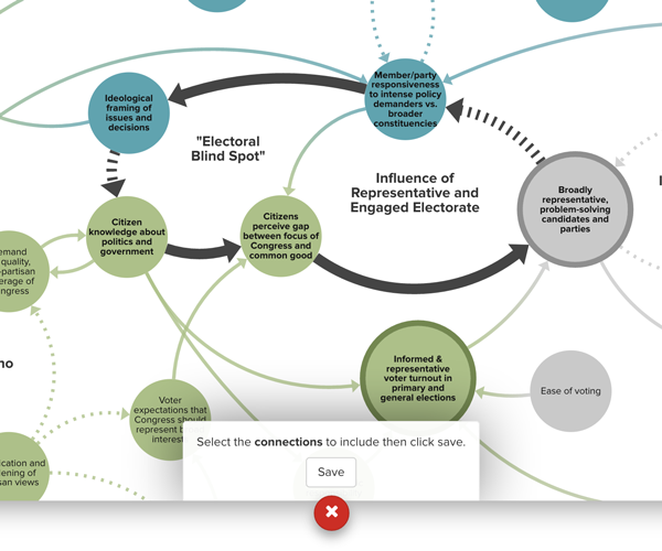
Systems mappers will love the new loop editor. Creating and editing loops is easier than ever, with more dominant styling of the connections that are included and no need to hold "shift" while you are adding or removing connections.
Clustering is now lightweight by default. Instead of permanently saving the new elements and connections to your map, clustering is now view-driven and updated on the fly.
For showcasing, we used to automatically include neighboring elements to provide context but found that to be an annoying assumption in some cases. Showcase behavior is now limited to the selection plus any connections within that selection. And to make it even easier to control, we've added a simple interface for adding and editing the showcase (which is - you guessed it - located in the settings menu along with everything else).
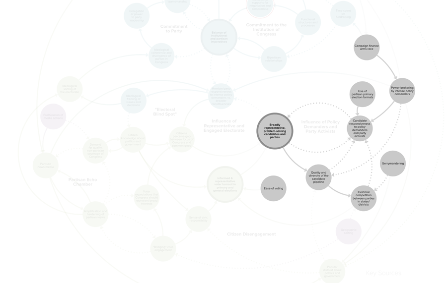
Oh, and all view settings (filter/focus/cluster) are now saved to the view to avoid surprises. Get your views looking just how you'd like them, click save, and you're all set!
Keep related actions close together
In the old UI you might edit a view in the left sidebar, switch to the right sidebar to change a default color or layout setting, then click a button in the bottom toolbar to add a decoration in a modal. We're sorry for the whiplash! In the new UI we've tried to group similar actions together so you'll hopefully find what you need in the first place you look for it.
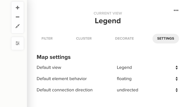
If you're trying to change how your map looks, just click on the settings button on the right side of the map:
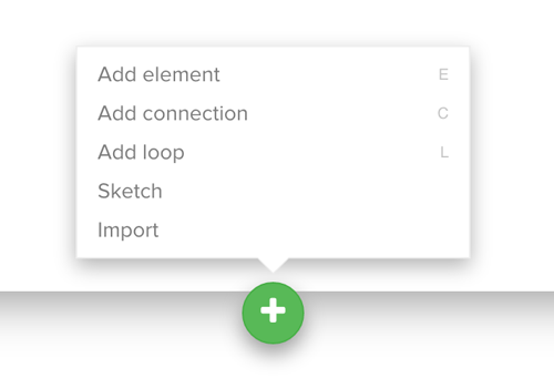
We've also consolidated all of the "add" actions behind a single green "+" button. Click on it any time you want to:
- Add an element
- Add a connection
- Add a loop
- Import data
If you want to move quicker, each one of those actions has a keyboard shortcut you can use to add content rapid fire. Just click on the help button in the lower left and scroll down to see all of the available shortcuts.
The less common project, map, and view actions are now nested within their own respective popup menus (look for the "..." buttons).
Wrapping up
We hope you love the new interface as much as we do. We've been working with it for a few months now and we honestly find it painful when we have to switch back to the old ui. We're confident you'll feel the same way. It might take a bit of getting used to, but we promise you'll be faster and more effective in no time. If you have any feedback or just need some help, please get in touch. We love hearing from you!
Enjoy!