Snap-to makes it easy to arrange a group of elements in a circle or line. This can be great for bringing order to a complex map or using concentric circles to show things like core vs. periphery stakeholders.
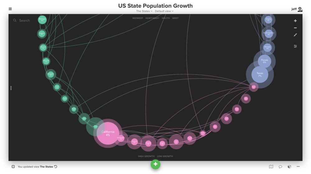
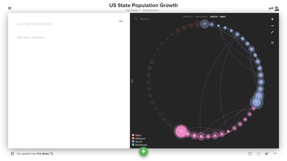
In this post we'll show how to use snap-to and other helpful features to create a map visualizing population growth in the US. Here's a sneak peek of the finished visualization:
Prefer to follow along by video instead?
Collecting and importing the data
The first step in collecting your data is to think about the fields you'll need for each element. Our focus is on population growth, so the fields we're looking to collect are:
- Label (name of the state)
- 2010 Population (to serve as a baseline)
- 2014 Population (to calculate growth)
- Growth (determined as a percentage from the above values)
- Region (west, midwest, south, etc.)
We can find most of this through a simple Google search and then re-arrange the data into Kumu's import format. Here's an example of the element import spreadsheet:
| Label | Type | 2010 Population | 2014 Population | Relative Growth | Region |
|---|---|---|---|---|---|
| Michigan | State | 9,876,498 | 9,909,877 | 0% | West |
| North Dakota | State | 674,345 | 739,482 | 10% | West |
| ... | ... | ... | ... | ... | ... |
Next, we need to determine whether we'll have any connections. Since being adjacent to certain states might influence population growth, we decided to use information about which states share borders to create the connection data. Here's a sample of the connection import spreadsheet:
| From | To |
|---|---|
| California | Oregon |
| Oregon | Washington |
| ... | ... |
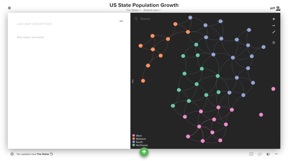
Coloring by region using categorize()
Color is one of the most powerful ways to distinguish between elements on a map. Since we're trying to spot whether there are any trends based on region, we'll color elements based on the region field.
The old (and slower) way to do this was to create a decoration for each region. Instead we're going to use @settings to define the colors automatically using the categorize() function.
@settings {
  element-color: categorize("region", set2);
}
This will automatically assign colors from the set2 color palette to each element based on the region field. You can find all the available color palettes here.
The last step is to add a legend based on these auto-assigned colors. The color-legend control makes this a breeze:
@controls {
  bottom-left {
    color-legend {
      colors: auto;
    }
  }
}
The setting colors: auto; forces the legend to display the colors we assigned with the element-color property above.
We'll also tweak some of the default settings of the map. Starting with the stakeholder template, we'll change the theme to "dark", change label placement for elements to "center", and change the default element label color to white. This can all be done through the settings menu. We then used the advanced editor to disable font-cutoff (where font is hidden when you are zoomed out) by setting it to 0.
Here's what our view looks like at this point:
@controls {
  bottom-left {
    color-legend {
      colors: auto;
    }
  }
}

@settings {
  template: stakeholder;
  element-text-align: center;
  theme: dark;
  element-color: categorize("region", set2);
  font-color: #fff;
  font-cutoff: 0;
}
And here's what the map looks like:
Snap to circle
To arrange the elements in a circle, first hit the a shortcut to select all elements. Then right click and choose "snap to" from the context menu:
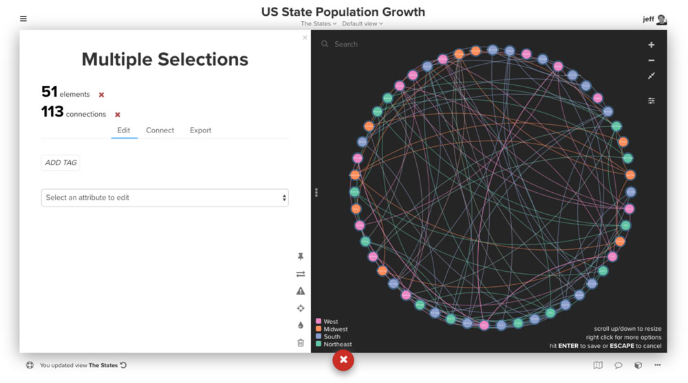
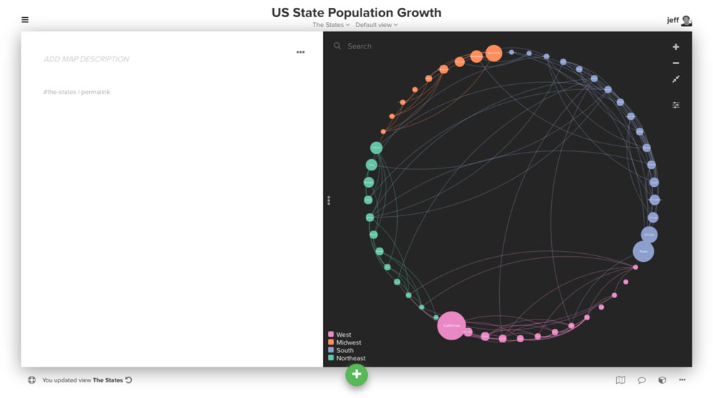
Grouping by region, sorting by population
While the elements are now arranged in a circle, it's still a mess. To clean up the layout we'll first group elements based on region so that all elements within a given region are next to each other. Just right click and then choose "group by" and then "region".
Next we'll sort within those groups based on population size. Right click again and then choose "sort by" and then "2014 population".
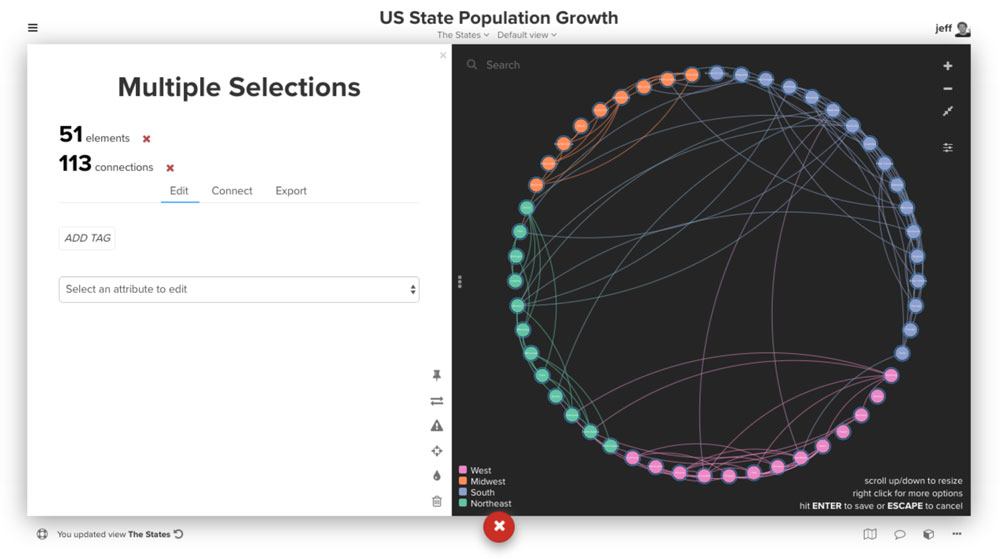
Now that we are happy with the placement, grouping and sorting of the elements, hit enter to save the positions and pin all the elements in place.
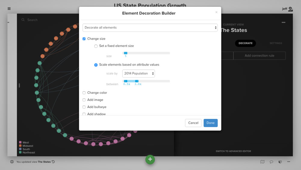
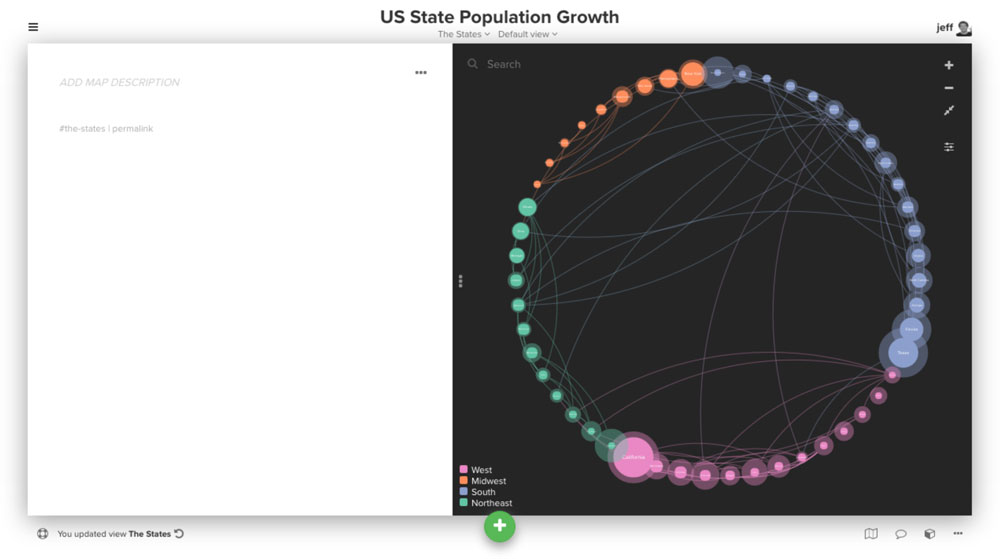
Aligning element size with sort order
While we've sorted by population, it isn't immediately obvious when looking at the map. By adding a decoration that sizes elements based on the 2014 population, we can make this much clearer.
Click the settings menu on the right side of the map and then click the decorate tab. Create a new element decoration rule that sizes all elements based on the "2014 Population" field.
Visualizing population growth with border-width
There are a number of other decorations you can use in addition to element size and color (we also support border, shadow, and bullseye) to differentiate between elements. We'll use the element border to visualize the relative population growth among states.
You have control over a number of different properties for the element border:
- border-width
- border-color
- border-opacity
By using these properties and the scale() function, we can add borders to each element where the width of the border is determined by the population growth for each state.
state {
  border-width: scale("relative growth", 1, 80);
  border-color: inherit;
  border-opacity: 0.4;
}
Using label templates to add growth percentage
To make the map even easier to understand at a glance, we'll also add the growth percentage to the label using label templates.
state {
  label: "{{label}}  {{percentage change}}";
}
By using a double space between {{label}} and {{percentage change}}, we can force a line break so that the percentage is always below the name of the state.
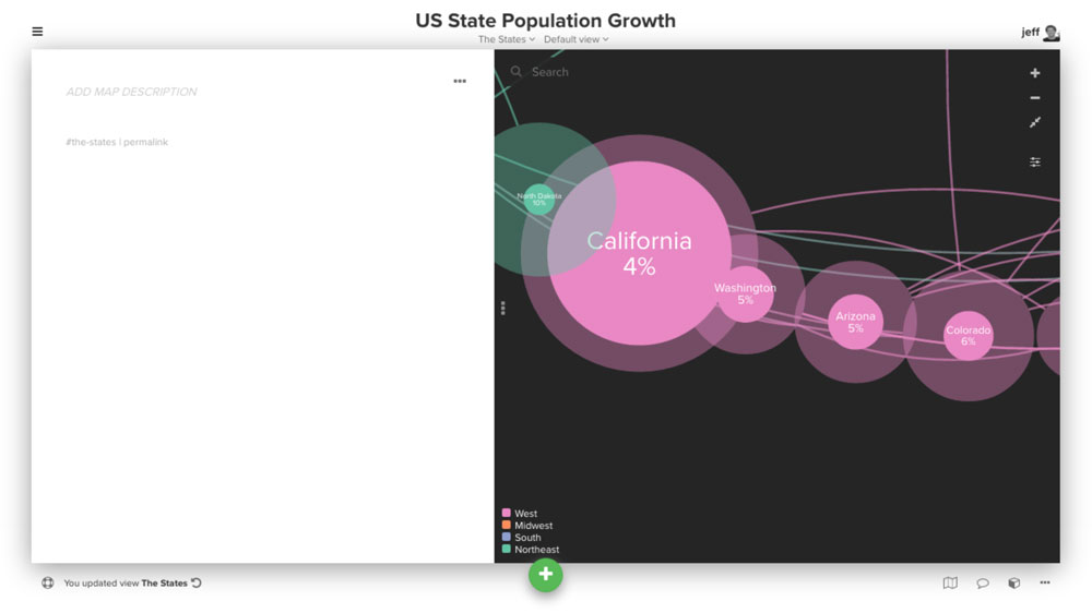
Note: Kumu doesn't yet support an explicit "percentage" field format so we ended up needing to add an additional field which included the % symbol in the data itself.
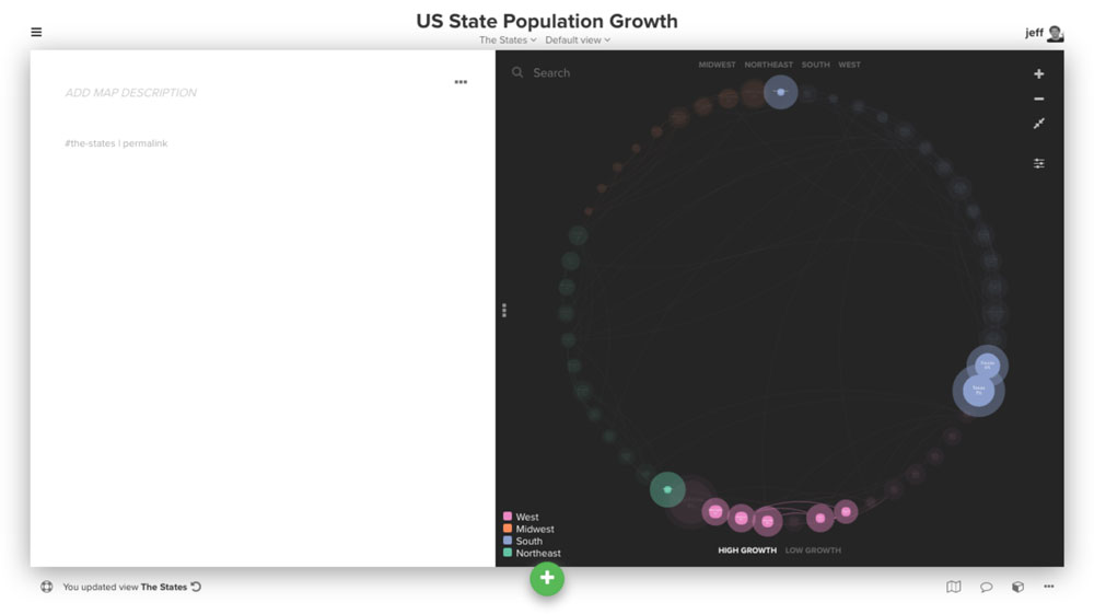
Adding controls to showcase by region
We're almost finished, but it might be nice to make it easier for users to showcase each of the regions. Luckily there's a control for that!
We'll use the showcase control to add labels for each region:
@controls {
  top {
    showcase {
      by: "region";
      as: labels;
      multiple: true;
    }
  }
}
Now someone can simply click on the name of the region to showcase all states from that region.
More interested in making it easy to showcase the high and low growth states? We'll add a second control at the bottom of the map:
@controls {
  bottom {
    showcase {
      as: labels;

      option {
        label: "High Growth";
        selector: ["relative growth">"0.05"];
      }

      option {
        label: "Low Growth";
        selector: ["relative growth"<"0.01"];
      }
    }
  }
}
We hope you enjoyed this tutorial! Below you'll find a link to download the data, the complete advanced editor code, and also the project JSON for the completed map.
Download the data
Download the project JSON
Advanced editor code
@controls {
  bottom-left {
    color-legend {
      colors: auto;
    }
  }
  top {
    showcase {
      by: "region";
      as: labels;
      multiple: true;
    }
  }
  bottom {
      showcase {
      as: labels;

      option {
        label: "High Growth";
        selector: ["relative growth">"0.05"];
      }

      option {
        label: "Low Growth";
        selector: ["relative growth"<"0.01"];
      }
    }
  }
}

@settings {
  template: stakeholder;
  element-text-align: center;
  theme: dark;
  element-color: categorize("region", set2);
  font-color: #fff;
  font-cutoff: 0;
}

element {
  scale: scale("2014 population", 0.5, 3);
}

state {
  border-width: scale("relative growth", 1, 80);
  border-color: inherit;
  border-opacity: 0.4;
  label: "{{label}}  {{percentage change}}";
}