Forbes released the 2013 Africa's 50 Richest People today which includes a visualization powered by Kumu. Continue reading to learn more about how it was created and how you can create your own.
Great Maps Start with a Question
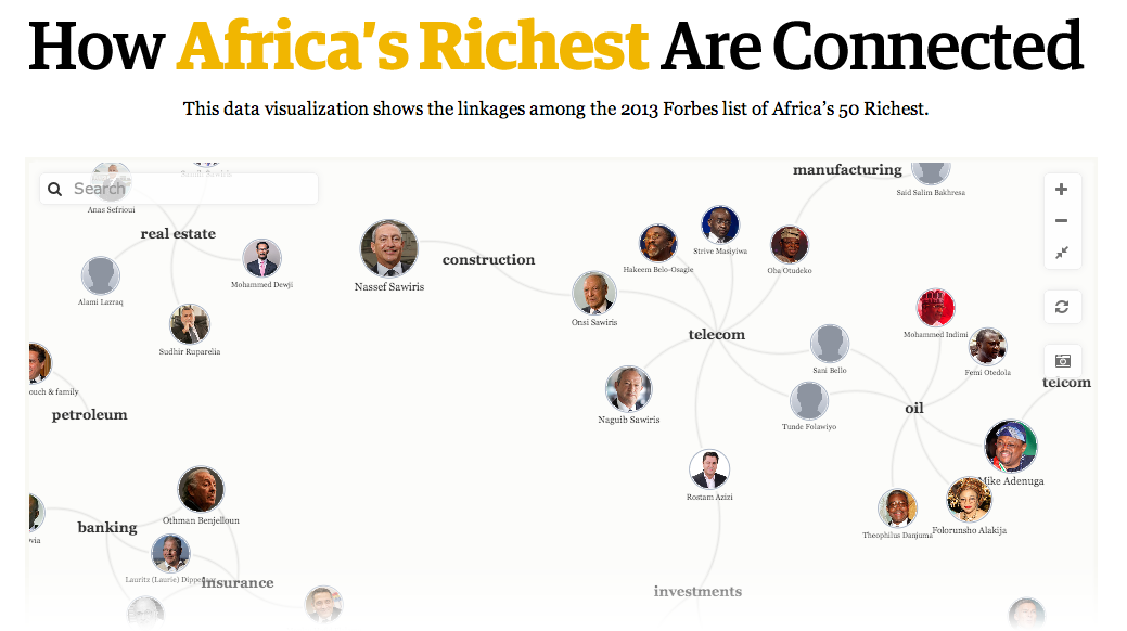
It's helpful to start with a clear question you're looking for the map to answer. A few questions driving this map include:
- Does industry play a strong role in who makes it onto the top 50 list?
- Are the top 50 mostly of the same age group?
- Are certain countries represented more than others?
- Are there any hidden connections keeping the top 50 in positions of wealth?
Originally we started with a hunch - that the richest 50 in Africa sit on each other's boards to a dangerous degree (a warning sign of a top-down power structure and possible corruption). Unfortunately board data wasn't widely available so that one will have to wait.
Gathering the Data
The Forbes team is awesome to work with and easily pulled together a spreadsheet with all the needed information.
Next, we made a few tweaks to get the spreadsheet ready for import:
- Changed the header of the "Display Name" column to "Label"
- Added an "Element Type" column with "Africa's 50 Richest" for each of the top 50
- Included age groups (50s, 60s, etc.) for better clusters
- Did a quick find and replace to swap out commas for pipes (|) in the "Industry" column
After that, we were about ready to import. The last step was to add a quick bio for each of the Top 50. We pulled the first few sentences from the material Forbes sent and then added a "Read More" link pointing to each person's full profile on Forbes. Here's the markdown syntax for Aliko's link:
[Read More.](http://www.forbes.com/profile/aliko-dangote/)
Adding Visual Elements
Colorful images can really polish off a map. For this one, Forbes provided images for the Top 50 and we pulled the flag for each country from Wikipedia. (Thanks Wikipedia!)
We added the images using two different techniques:
Top 50: By Attribute
For the Top 50, we simply added the image url as the "Image" attribute. This automatically includes the image on the map and in the upper right corner of the profile.
Countries: By Perspective
Since countries are virtual elements, we didn't have an "Image" attribute to assign to. Instead we styled each country through the perspective using shorthand ids and the image-url property.
Here's Kenya as an example:
#kenya { image-url: url(/images/flags/kenya.png); }
Clustering
The next step was deciding what to cluster by. Kumu's virtualization feature makes it easy to connect elements based on any information stored in the profile. This is where defining your questions up front really helps.
Rather than overwhelming users, we focused on three primary ways the Top 50 are connected:
- By the source of wealth (industry)
- By citizenship (country)
- And by age group
Each of these can be toggled on and off independently allowing half a dozen interesting ways to look at the Top 50.
Perspectives
Perspectives tie attributes to visual styles. It's easy to go overboard here. Less is usually more.
For this map we used the minimum amount of color and size needed to draw attention where we wanted it. Here are the specific steps we took:
- Highlight the wealthiest people by scaling the Top 50 by net worth
- Bump up the size of countries so each flag is recognizable
- Minimize distractions by only showing labels for industries and age groups
Embedding on Forbes
Dropping the map into the Forbes website only took this short snippet of code:
<iframe src="http://x.kumu.io/forbes/africa-2013/" width="100%" height="500" frameborder="0" style="border: 5px #efefef solid; border-radius: 5px;"></iframe>
Insights
Here are some of the key insights and takeaways that come from interacting with the map:
- Men in their 50s and 60s dominate the list.
- The top 50 represent only 10 countries out of 55 total in Africa.
- Oil, telecom, real estate, and diversified are the most prominent industries.
- Everyone who made their fortune from oil is from Nigeria